Documentation of (mostly) my third year on BA Fine Art: Print & Time Based Media at Wimbledon College of Art, UAL.
Purple Ronnie
Giles Andreae's Purple Ronnie was around when I was growing up and I suppose it was kinda fun for kids to see a cartoon figure that was a very cheeky adult doing cheeky adult things in a tongue-in-cheek way. I like Purple Ronnie's style as he is drawn in such a simple way with smiles and bright colours and other stylings often present in children's books, but obviously is not a children's character. Purple Ronnie's personality transcends his simple style - although I suppose he is a simple character, but there is something very real about him - something recognisable as a part of every adult person. He is a bit like Rupert Fawcett's Fred or Ernie Bushmiller's Nancy in that respect, although those characters are more grumpy and exasperated in their interactions with life - Purple Ronnie is more of a silly celebration of life and the potentially disappointing or awkward parts of life e.g. sex, drinking, friends, etc.
Purple Ronnie is very uplifting as a character. Always smiling, there is no sadness in Purple Ronnie's world, even in the face of binge drinking or body self-consciousness. I doubt Purple Ronnie has any regrets.
Björk shot by Stefan Malzorn / worldmaking
I wanted to write about these pictures because they are really happy pictures to me. They're so vibrant, candid, and cute. Björk is so adept at creating her own magical worlds, visually, aurally, and in her whole self, and I think these pictures convey that sense of fantasy world-ness. All the lucid textures, natural expression & plant life, and Moomin wonderland colours combine in a kinda simple seeming way that's busy enough to make a whole world appear in my head when I look at these images.
Paper Rad's Tux Dog
![]() |
| all images taken from paperrad.org/tuxonthetown |
It's interesting to note that, in this series of images, Tux Dog is a cartoon entering and interacting with the real world. In most of my work so far it's a sort of opposite - I'm interacting with a make believe world, in which I and other characters exist as cartoons. It's this world which I am then transporting back to the real world to be viewed through windows of pages and paintings. Perhaps, considering this, my work needs to be more expansive, more adept at bringing my dreamworld into the real world. The real world interacts with Tux Dog, but where does my dreamworld interact with real world denizens?
Paper Rad
| image and screenshots taken from paperrad.org and paperrad.org/newindex.html |
I love Paper Rad's weird net collages, full of clip art and word art and odd artefacts - glitches, glitter graphics, screenshots, and graphics which have an air of the unusual and an internet museum-y feel with lots of geocities/old computer stuff. Digital collages can do so many things that physical ones can't and they have such a different feel. The Paper Rad websites remind me of this school project website too.
There is a nostalgia which tends to be inherent to net collages and net art in general, pointing towards the dinosaur feel of old technology in the face of the relative youth of computers and the internet. Things from the early 2000s seem so dated now, but are also very fondly remembered by those of us who grew up just as computers were starting to become household appliances.
I just love the sense of collection in stuff like this. It reminds me of collecting Beanie Babies and Pogs and magazines and stuff in the 90s - these "collection cultures" kinda add up and feed into collage webpages like this. I had my own website on freewebs in the mid 00s. It had a chatroom, guestbook, stupid collections of pictures and quotes from friends, a diary page (my first blog!). A kid's first venture into the online world is embarrassing but so fascinating.
Collages by Amelia Durie
![]() |
| Images taken from ameliadurieartist.wordpress.com |
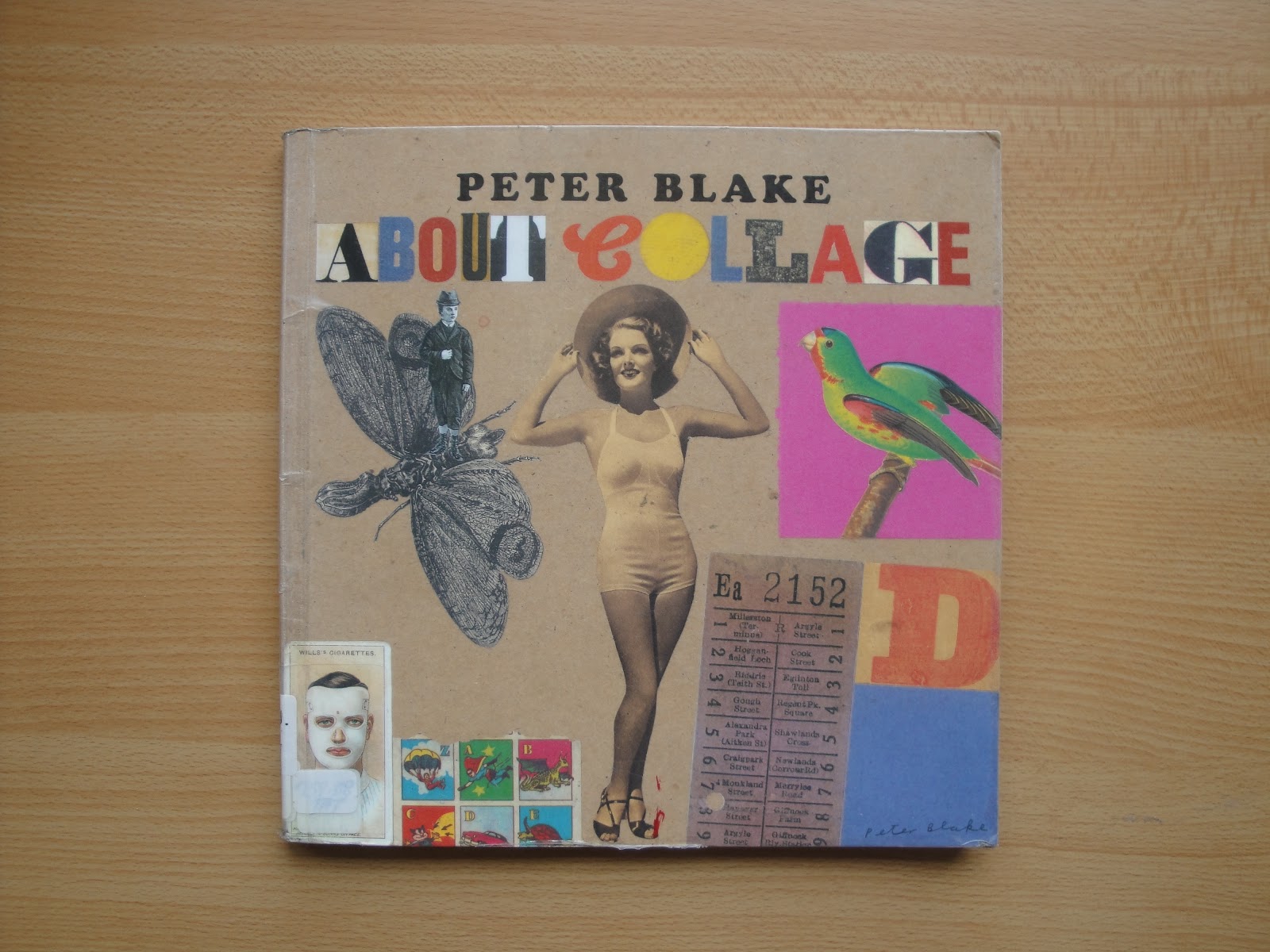
About Collage - Peter Blake
I am a big fan of collage because it's a great method of altering or reinterpreting work to make something fresh. I use collage with my own drawings when I'm dissatisfied with the composition of a drawing or page or when I want to gather up source materials and mould them into something different. It's such a flexible way of working, and being into zines has made collage something I needed to use to get the right layout.
In the preface of this book, Laura Biggs (Director of Tate Liverpool) asserts that "the selection [of collages shown in the book] uncovers the human, irrepressible impulse to gather, fuse, and fix" (Blake et al, 2000). It's fascinating to look through the various assemblages - lots of stuck together magazine heads and old adverts and papers, but also plenty of protruding objects stuck onto old boards, scrap metal, rocks, etc. Clearly collage can be a lot more than paper stuck to paper. Blake explains that "collage can encompass anything where something is attached to something else" (Blake et al, 2000). This is evidenced in Karel Appel's Questioning Children (fig. 1) and Blake's own Memories of Place (fig. 2).
Objects protrude from both pieces. Appel's work is brightly and beautifully decorated across the collaged objects, turning them into colourful creatures, whereas Blake's work has more of a muted, still life feel to it.
![]() |
| fig 2. Peter Blake - Memories of Place, c.1982 |
The book discusses the collagists Kurt Schwitters, Joseph Cornell, and Eduardo Paolozzi, as well as anonymous collages. Blake muses on why collage might appeal to artists, and touches on the circumstances of people's entrance into collaging. He says "what prompts people to make objects is fascinating and a whole area in itself" (Blake et al, 2000), leaving that particular topic for the reader to consider.
- Blake, P, Ades, D, and Rudd, N. (2000). About Collage. London: Tate Gallery Pub. p. 9, 7,11
- Tate.org.uk, (2004). 'Questioning Children', Karel Appel | Tate. [online] Available at: http://www.tate.org.uk/art/artworks/appel-questioning-children-t04158 [Accessed 16 Jun. 2014]
PPD Summary
INITIAL PLANNING & PROBLEMS
Initially, when faced with PPD, I was confused about where to look and what to look for concerning placements, so I made plans for my own exhibition (fig 1). The idea was to assemble very childlike, pink objects and paintings in a room which appeared like a child’s own fantastical world. I wanted to use a pub function room, but I had trouble finding a suitable place, and it soon appeared that I had been too ambitious. When the opportunity to work internally at Wimbledon’s own series of installations and performances, Acts-Reacts, I was relieved and eagerly signed up. Unfortunately I had a few organisational issues - I discovered too late that my emails weren’t sending and as a result I missed early introductions to what Acts-Reacts was and what volunteers would be doing. I did eventually go along to start assisting with show setup, but quickly found myself overwhelmed and anxious, lost amongst the group of volunteers that seemed well aware of what they were doing already. My discomfort rapidly reached a crescendo and I elected to leave the project and put PPD to the back of my mind for a while in order to look after myself.
fig 1 - sketchy early exhibition plans
When PPD was brought up again after the Easter break I talked to Barby and Rosie, who suggested I might work with the library to create an exhibition there. This seemed like a good idea as it would allow me to use easily accessible space within the college and it would afford me a high level of control, which in turn would allow me to be comfortable and confident about the project, avoiding triggering feelings of anxiety and worry.
CONSTRUCTION & EXPERIMENTATION
Similarly to my earlier exhibition ideas, I wanted to make works which gave an idea of a childlike alternate universe, almost, but this time a more direct and simplistic interpretation of my own childhood and life. I wanted to experiment with forms and to create a more 3D method of presentation since I have created very flat works before and have struggled with how to display that work in a way that creates a visual and spatial context for it, so I spent time attempting foam sculptures (fig 2) and considering how I might bring more spatial depth to my work so that it might be more arresting for viewers, and more indicative of the world inside my head which my artwork comes from.
fig 2 - making foam sculptures
My sculptures ultimately did not convey any of my themes or ideas sufficiently and looked out of place and senseless, but it was useful to make them as it made me more aware of physical space and how works might occupy space. It was also useful to, in the process of making foam sculptures, test out some of the bright colours I intended to use for the project.
I had made a few miniature paintings at the same time as my construction of the foam sculptures, and following the construction of the sculptures, I decided on making rough oval frames out of cardboard to house the small paintings, making my work immediately reminiscent of childhood artwork and craft activities, and bridging the gap between flat work and something more sculptural and 3D. I was pleased to have figured out an effective method of presentation which appeared (and was!) deliberate.
INCORPORATING THE LIBRARY ARCHIVE
.
I knew that I wanted to incorporate something from Wimbledon’s archive, as this would benefit my work by providing artistic and historical links and context, and would take my exhibition from merely being situated in the library, to being directly relevant to the library as well as the college itself and its archives. This would also be a way to show my proficiency in investigating and organising materials and information and working with staff in the library to curate a coherent exhibition involving the work of others as well as providing a more educational element to my exhibition which would add depth to it.
I spoke to Allison about the focuses of my exhibition and she kindly introduced me to the archive, where I was able to read some fascinating Wimbledon history and some funny newspaper cuttings (fig 3).
fig 3 - naughty students
Allison suggested the “Where are we going?” concertina book (figs 4 & 5), which immediately caught my eye as it used similar bright colours to my work, was actual work by children, and was made in 1999 - all these things making it very relevant to my pieces. After sifting through the archive for a while I came back to the book and decided I had to display it alongside my work - it was perfect!
fig 4 - “Where are we going?”
fig 5 - “Where are we going?”
MAKING THE EXHIBITION
Across the week before the exhibition was to be installed (8th May), I made the little paintings (figs 6 & 7), their frames, and the descriptive text to sit alongside the paintings and the concertina book (fig 8). I wanted the text to make the link between my work and the book from the archive, but I also wanted it to sound quite flippant and dreamy - to itself have a childish voice, and a childish appearance.
fig 6
fig 7
fig 8
WHAT I HAVE LEARNED
Organising this exhibition has shown me that finding links to other work can provide an incredibly useful context and frame of reference for my work, making it easier for viewers to understand and appreciate aspects of it that I have previously struggled to convey. I have also discovered how easy and rewarding it can be to discuss my ideas and themes with other people and to elicit their help and knowledge. I have learnt how to be in more direct control of my own guidance, experimentation, and production, and how to better enact an artistic/curatorial process in a comfortable and engaging way. I look forward to presenting more coherent and accessible work in the future, as this exhibition has had a great impact on my understanding of the context and frameworks surrounding my work.
Subscribe to:
Posts (Atom)