Going back to the introspective, diary-based branch of my stuff, I made this book of photos with handwritten commentary, only the commentary is mad, floaty, and made-up. I suppose I wanted to make stories or something for entertainment value (I definitely wanted to be funny here). I suppose it's interesting to compare this to people's genuine presentations of themselves online or in personal things that they know are going to be made private - made to represent them and usually containing some level of genuine self, but inevitably a somewhat warped representation of that person. This is obviously different in that it takes my personal photos and adds text to place them in a nonsensical, make believe context, precisely for the purposes of public display and entertainment. But the pictures still retain a level of real-life representation.
Documentation of (mostly) my third year on BA Fine Art: Print & Time Based Media at Wimbledon College of Art, UAL.
Colour experimentation (pastels)
I did some super hurried colour mixing/palette experiments on books pages with chalk pastels. The last and third pages are my favourites. The last incorporates a wealth of colours and they are all distributed well and make something very bright and potentially uplifting. It's like Jason's technicolour dreamcoat. A great mixture of warm and colder colours.
The third reminds me of Henri Matisse's colour choices - extremely rich and evocative perhaps of some exoticism (bright fruits and bright clothes and naked dancing people who are not soft browns or peaches but a deep, fruity orange). I'm actually not a fan of Mattise as I find many of his depictions of people dull and, well, suffering from exoticism. The colours I can admire, but the depictions themselves seem empty, objectifying, exploitative.
I liked that I could do these experiments really vigorously and quickly. Speedy, almost hedonistic art is quite pleasing. That physical enjoyment lends itself to a real cheering factor which I'd like to follow in a quest of emotion and chemical response. What's the best way to find that good feel?
Also, colour wise, I'd like to compare Matisse-esque colouring to the more subdued colour style of Paul Cezanne.
Cross pathway private view, 1st Oct
These are my two favourite pieces from today's private view:
![]() |
Mavis Qu |
![]() |
Joe Brown |
Mavis' work is inspiring to the work I plan to make in exploring personality through appearance and style, and Joe's is more my general style and can inform my exploration into childlike art and the expression of and influence on emotion in art. It's also worth examining his colour palette. He seems to have used quite moody colours, which perhaps enhance the effect of the text.
Wearing Bart Simpsons
I know that many people like to wear Bart Simpsons now (thanks to Jeremy Scott's Bart knits, of which cheap copies exist in abundance), so I made my own Bart Simpson paper skirt. It's more fun than the other Bart Simpson skirts because all the Bart Simpsons look a little different and you can colour them in.
This links my identity through style interest to my childlike art interest. I'd kinda like to make a lot of totally unwearable clothes out of paper and stuff, with cartoon characters on them. that's definitely something a kid would do.
Sailor Moon, Biker Mice From Mars, Digimon?
cute lil babies
I've been making these cute and very similar little paintings:
I have collected a bunch of artists who I love who have this cute sort of aesthetic, and who influence me and encourage me and uplift me greatly. I'll showcase a bunch of their work below:
![]() |
http://sleepyberry.tumblr.com/ |
![]() |
http://sleepyberry.tumblr.com/ |
![]() |
http://sleepyberry.tumblr.com/ |
![]() |
http://sleepyberry.tumblr.com/ |
![]() |
http://minipete.tumblr.com/ |
![]() |
http://minipete.tumblr.com/ |
![]() |
http://minipete.tumblr.com/ |
![]() |
http://milkbbi.com/ |
![]() |
Mogu Takahashi |
The Ruling Passion/Reading Aloud (colour & mood)
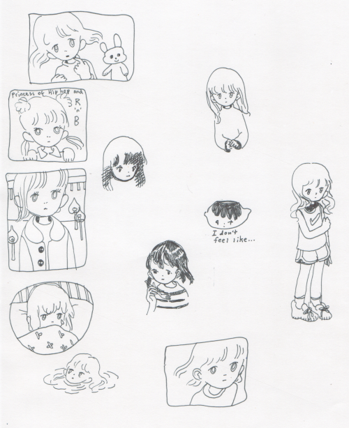
These are some more paintings from Kelvingrove museum which I think have beautiful tone and colouring. In the first, below, I particularly like the variation in hair colour, and the expression and form of the people. I'm particularly interested in the girl on the left, and her distance from the scene. She looks more subdued than the rest. Colder? I felt like I can sit in her place. There's this strange feeling of relation that I have towards her. This has great value to my work, it's a very interesting emotional response. I see myself in this girl, but why? It's not just because I like her hair (although you know, that's compelling). I think she looks like later she'll run away across a field, although that may just be evidence of me having seen too many dramatic Jane Austen dramas.
![]() |
The Ruling Passion (or The Ornithologist), 1885 John Everett Millais |
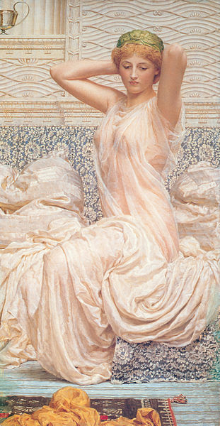
"[He was] known for his depictions of languorous female figures set against the luxury and decadence of the classical world."
"[...]every picture was the result of a carefully thought out and elaborated harmony in pose and colour, having as its basis the human form, studied in the true Hellenic spirit."
"The chief charm of Moore's pictures lay in the delicate low tones of the diaphanous, tissue-like garments in which the figures were draped."Other paintings echo the ethereal, ideal sense of "Reading Alone" - they're very cinematic, and I feel a sense of childlike awe looking at their soft peachy colours and depiction of sheer fabric.
![]() |
Silver |
The Glasgow Boys (colour & mood)
Looking at the work of The Glasgow Boys at Kelvingrove, I was struck by the bright, sunny hues present in many of their paintings. Lots of them depict beautiful rural scenery, very much idyllic. I've been thinking about possible restorative/soothing qualities of art, and art as a sort of therapy or activity of self-care, as well as art encouraging happy feelings in others. Colour inevitably is important when considering this, and I felt that the light (but somehow rich, buttery?) use of colour in many of these paintings was really encouraging and pleasing and conducive to a pleasant feeling, much like nature or light or something else can make me feel very soft and grateful to be able to experience whatever it is I'm experiencing. So I want to focus on what effect my colour palette gives, and how this affects FEELINGS.
My pictures don't convey how sweet and delicate and light these colour palettes are to their full extent, but anyway:
A Surrey Meadow - Morning, 1880 EA Walton |
The Coming of Spring (detail), 1899 EA Hornel |
The Coming of Spring, 1899 EA Hornel |
Autumn, 1895 John Reid Murray |
Subscribe to:
Posts (Atom)