AnnLee

Stills from Anywhere Out of The World, 2000.
"In 1999, the artists Pierre Huyghe and Philippe Parreno bought a manga character from “K” works, a Japanese firm that develops Manga figures. Huyghe and Parreno decided to 'free the image from the animation market', named 'her' Annlee, made their own initial works and invited other artists to use Annlee for new art projects, free of charge. Annlee was given a voice, history and an identity and she popped up in animation videos, paintings, objects, installations, posters and a magazine, soundworks and a book. In the end 28 works were produced by 18 different artists. The project was finalized in 2002 with the artists definitively killing her off (including a coffin) and liberating her from the realm of representation -as they described it- by signing over the copyrights of the image to Annlee herself." (Istha, 2012)
AnnLee is a really interesting use of a character. She was a blank slate - a cookie cutter character with nothing much in the way of distinguishing features. But she became a vessel for a collage of all these different personalities and ideas - she became so full of all this stuff, and yet she was still this blank, robotic character.


  1. Istha, M. (2012). Call for new Annlee art works. [online] rhizome.org. Available at: http://rhizome.org/announce/opportunities/58508/view/ [Accessed 24 Jun. 2014].

Disney Colour Palettes

Snow White - 1937
Cinderella - 1950

I saw these screenshots from various Disney films and was struck by their beautiful colour palettes - perfectly dreamy with careful combination of muted and rich tones. These create such a softness, such a delicate, enchanted vibe to the fairy tale lands the films depict with such a vibrancy. The lighter blonde lines in and around Aurora's hair in Sleeping Beauty is a stand out detail which works to make her look ethereal and magical.

Also of note is the stylistic difference - particularly the soft, round look of Snow White compared to the angular design of Sleeping Beauty (look at the difference in their faces!). To some extent this is evidence of aesthetic preferences of the 1930s and 50s respectively, and it's interesting how this affects the worlds the two films portray. Snow White is more foggy and dreamlike in comparison with the sharp, agile fairy look of Sleeping Beauty. Both convey similar stories but have an immensely different style, with lots of subtleties.

Sleeping Beauty - 1959
The Little Mermaid - 1989

Sculptures by Philippa Haines

All photos taken from Philippa Haines on Flickr.
I successfully Googled my high school art teacher. It's fascinating to see her work for the first time - these weird, fantastical figures. They remind me of the film MirrorMask, designed and directed by Dave McKean -  known for his ethereal, spooky, and slightly cartoonish dreamscapes (and his Sandman comic book covers, which reminded me of Anselm Kiefer when I first saw them). McKean and Haines are similar in that their work shares that perfect cartoonish spook feel. This kinda makes me feel like an enchanted little kid being told an elaborate story. It's like a nostalgia for something that doesn't exist - that special kind of excitement when you could almost believe a myth or legend. They also remind me of the BBC TV series adaptation of Gormenghast.

I remember, when I was really young, I had a book about an enchanting woman who lead someone into a forest. I have tried to remember more details about this book so many times in later life and have never succeeded in finding out what it was, and it sounds ridiculous, but I feel like I lost a world. I remember the feeling I would have when I read this book was the most intense feeling of curiosity and imagination and I think my whole body would shiver. I was as enchanted by the book as the character in the book was enchanted by this woman, to the extent that I wanted to jump into the book and become lost in that story's world. I think I actually came close to believing it was real, like my own version of Narnia or Jumanji.

I can begin to emphasise enough just how intense this experience was, but everything else I've discussed in this post evokes a smaller level of that incredibly enchantment, that mysticism and yearning to enter the fictional world, whether the world is directly described or shown, like in MirrorMask or Gormenghast, or merely suggested by a single figure or image, like Haines' sculptures.


Purple Ronnie


Giles Andreae's Purple Ronnie was around when I was growing up and I suppose it was kinda fun for kids to see a cartoon figure that was a very cheeky adult doing cheeky adult things in a tongue-in-cheek way. I like Purple Ronnie's style as he is drawn in such a simple way with smiles and bright colours and other stylings often present in children's books, but obviously is not a children's character. Purple Ronnie's personality transcends his simple style - although I suppose he is a simple character, but there is something very real about him - something recognisable as a part of every adult person. He is a bit like Rupert Fawcett's Fred or Ernie Bushmiller's Nancy in that respect, although those characters are more grumpy and exasperated in their interactions with life - Purple Ronnie is more of a silly celebration of life and the potentially disappointing or awkward parts of life e.g. sex, drinking, friends, etc.

Purple Ronnie is very uplifting as a character. Always smiling, there is no sadness in Purple Ronnie's world, even in the face of binge drinking or body self-consciousness. I doubt Purple Ronnie has any regrets.


Björk shot by Stefan Malzorn / worldmaking


I wanted to write about these pictures because they are really happy pictures to me. They're so vibrant, candid, and cute. Björk is so adept at creating her own magical worlds, visually, aurally, and in her whole self, and I think these pictures convey that sense of fantasy world-ness. All the lucid textures, natural expression & plant life, and Moomin wonderland colours combine in a kinda simple seeming way that's busy enough to make a whole world appear in my head when I look at these images.

Paper Rad's Tux Dog

all images taken from paperrad.org/tuxonthetown
I'm not sure what to make of Tux Dog. He reminds me of Parappa The Rapper - same goofy look and floppy ears. The picture above, particularly, made me laugh. Tux Dog infiltrates the real world in these photos, seemingly causing a little chaos and silliness on the way. It's interesting to see how Tux Dog's interactions with people (appear to) play out. He seems well liked.

It's interesting to note that, in this series of images, Tux Dog is a cartoon entering and interacting with the real world. In most of my work so far it's a sort of opposite - I'm interacting with a make believe world, in which I and other characters exist as cartoons. It's this world which I am then transporting back to the real world to be viewed through windows of pages and paintings. Perhaps, considering this, my work needs to be more expansive, more adept at bringing my dreamworld into the real world. The real world interacts with Tux Dog, but where does my dreamworld interact with real world denizens?


Paper Rad

image and screenshots taken from paperrad.org and paperrad.org/newindex.html


I love Paper Rad's weird net collages, full of clip art and word art and odd artefacts - glitches, glitter graphics, screenshots, and graphics which have an air of the unusual and an internet museum-y feel with lots of geocities/old computer stuff. Digital collages can do so many things that physical ones can't and they have such a different feel. The Paper Rad websites remind me of this school project website too.

There is a nostalgia which tends to be inherent to net collages and net art in general, pointing towards the dinosaur feel of old technology in the face of the relative youth of computers and the internet. Things from the early 2000s seem so dated now, but are also very fondly remembered by those of us who grew up just as computers were starting to become household appliances.

I just love the sense of collection in stuff like this. It reminds me of collecting Beanie Babies and Pogs and magazines and stuff in the 90s - these "collection cultures" kinda add up and feed into collage webpages like this. I had my own website on freewebs in the mid 00s. It had a chatroom, guestbook, stupid collections of pictures and quotes from friends, a diary page (my first blog!). A kid's first venture into the online world is embarrassing but so fascinating.


Collages by Amelia Durie

Images taken from ameliadurieartist.wordpress.com
I saw Amelia Durie's work at the Wimbledon College of Art 2014 degree show and liked her delicate use of light as well as her obvious interest in working in books, which I can enthusiastically relate to. The ghostly, transparent look she creates with some of her layers is so ethereal and lovely. It gives a lot of depth to the pieces as it contrasts with the opaque cut outs, sort of supporting them and enhancing them. Her compositions are quite simple and confident - they look well calculated and definitively finished. Much cleaner than pieces I usually make at the moment incorporating collage, but Durie's smart collages actually remind me a little of collages I made during my fine art a level, which were much more carefully composed as I was learning how to construct effective compositions at the time. Now I tend to enjoy busier compositions, but after experimenting with a more sparse style in my The Bone zine, I was struck by the sort of neat look and felt like it made the content important and possibly easier to take in and respond to.

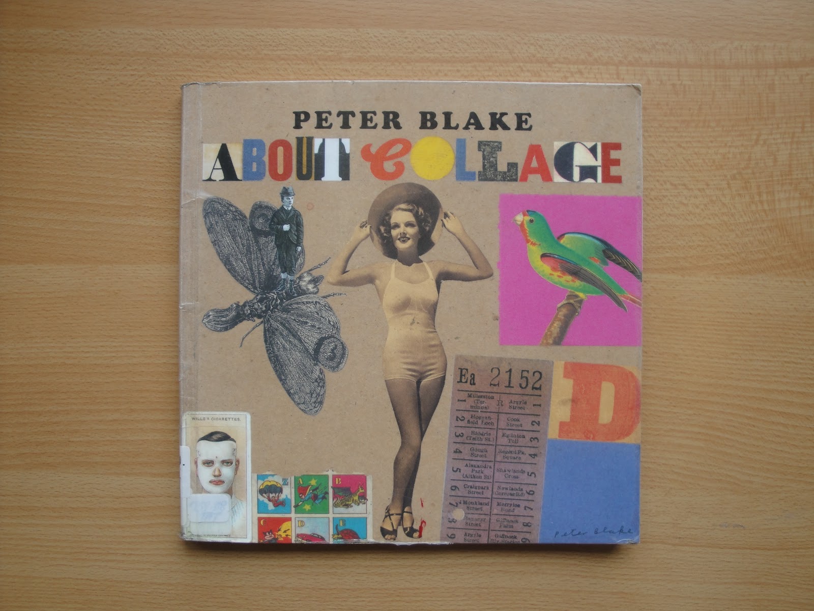
About Collage - Peter Blake


I am a big fan of collage because it's a great method of altering or reinterpreting work to make something fresh. I use collage with my own drawings when I'm dissatisfied with the composition of a drawing or page or when I want to gather up source materials and mould them into something different. It's such a flexible way of working, and being into zines has made collage something I needed to use to get the right layout.

In the preface of this book, Laura Biggs (Director of Tate Liverpool) asserts that "the selection [of collages shown in the book] uncovers the human, irrepressible impulse to gather, fuse, and fix" (Blake et al, 2000). It's fascinating to look through the various assemblages - lots of stuck together magazine heads and old adverts and papers, but also plenty of protruding objects stuck onto old boards, scrap metal, rocks, etc. Clearly collage can be a lot more than paper stuck to paper. Blake explains that "collage can encompass anything where something is attached to something else" (Blake et al, 2000). This is evidenced in Karel Appel's Questioning Children (fig. 1) and Blake's own Memories of Place (fig. 2).

fig 1. Karel Appel - Questioning Children, 1949
"Appel prepared the surface of Questioning Children by nailing discarded pieces of wood to an old window shutter. The vibrant colours and roughly-painted figures recall the spontaneity of children’s art. CoBrA artists believed that such unconventional sources could re-invigorate post-war culture. In the same year Appel also used the title Questioning Children for a controversial mural at the Town Hall in Amsterdam, which was condemned as incomprehensible, and covered over with wallpaper. There is a note of tragedy in these works as the Dutch title also means 'begging children' and evokes scenes of poverty that Appel had witnessed in post-war Germany" (Tate.org.uk, 2004).

Objects protrude from both pieces. Appel's work is brightly and beautifully decorated across the collaged objects, turning them into colourful creatures, whereas Blake's work has more of a muted, still life feel to it.

fig 2. Peter Blake - Memories of Place, c.1982
I'm intrigued by this description of Blake offered in the book's preface: "Peter claims to have 'emotionally retired' from the art world" (Blake et al, 2000). It's not given too much context, but it appears Blake focusses on making work for himself, for the pure joy of it, ignoring the institution to enjoy himself. Sounds ideal. This line is offered in the spirit of fun, but it does suggest the potential exasperation of being involved in the art world proper.

The book discusses the collagists Kurt Schwitters, Joseph Cornell, and Eduardo Paolozzi, as well as anonymous collages. Blake muses on why collage might appeal to artists, and touches on the circumstances of people's entrance into collaging. He says "what prompts people to make objects is fascinating and a whole area in itself" (Blake et al, 2000), leaving that particular topic for the reader to consider.

  1. Blake, P, Ades, D, and Rudd, N. (2000). About Collage. London: Tate Gallery Pub. p. 9, 7,11
  2. Tate.org.uk, (2004). 'Questioning Children', Karel Appel | Tate. [online] Available at: http://www.tate.org.uk/art/artworks/appel-questioning-children-t04158 [Accessed 16 Jun. 2014]