PPD Summary

INITIAL PLANNING & PROBLEMS

Initially, when faced with PPD, I was confused about where to look and what to look for concerning placements, so I made plans for my own exhibition (fig 1). The idea was to assemble very childlike, pink objects and paintings in a room which appeared like a child’s own fantastical world. I wanted to use a pub function room, but I had trouble finding a suitable place, and it soon appeared that I had been too ambitious.  When the opportunity to work internally at Wimbledon’s own series of installations and performances, Acts-Reacts, I was relieved and eagerly signed up. Unfortunately I had a few organisational issues - I discovered too late that my emails weren’t sending and as a result I missed early introductions to what Acts-Reacts was and what volunteers would be doing. I did eventually go along to start assisting with show setup, but quickly found myself overwhelmed and anxious, lost amongst the group of volunteers that seemed well aware of what they were doing already. My discomfort rapidly reached a crescendo and I elected to leave the project and put PPD to the back of my mind for a while in order to look after myself.

fig 1 - sketchy early exhibition plans

When PPD was brought up again after the Easter break I talked to Barby and Rosie, who suggested I might work with the library to create an exhibition there. This seemed like a good idea as it would allow me to use easily accessible space within the college and it would afford me a high level of control, which in turn would allow me to be comfortable and confident about the project, avoiding triggering feelings of anxiety and worry.

CONSTRUCTION & EXPERIMENTATION

Similarly to my earlier exhibition ideas, I wanted to make works which gave an idea of a childlike alternate universe, almost, but this time a more direct and simplistic interpretation of my own childhood and life. I wanted to experiment with forms and to create a more 3D method of presentation since I have created very flat works before and have struggled with how to display that work in a way that creates a visual and spatial context for it, so I spent time attempting foam sculptures (fig 2) and considering how I might bring more spatial depth to my work so that it might be more arresting for viewers, and more indicative of the world inside my head which my artwork comes from.

fig 2 - making foam sculptures

My sculptures ultimately did not convey any of my themes or ideas sufficiently and looked out of place and senseless, but it was useful to make them as it made me more aware of physical space and how works might occupy space. It was also useful to, in the process of making foam sculptures, test out some of the bright colours I intended to use for the project.

I had made a few miniature paintings at the same time as my construction of the foam sculptures, and following the construction of the sculptures, I decided on making rough oval frames out of cardboard to house the small paintings, making my work immediately reminiscent of childhood artwork and craft activities, and bridging the gap between flat work and something more sculptural and 3D. I was pleased to have figured out an effective method of presentation which appeared (and was!) deliberate.

INCORPORATING THE LIBRARY ARCHIVE
.
I knew that I wanted to incorporate something from Wimbledon’s archive, as this would benefit my work by providing artistic and historical links and context, and would take my exhibition from merely being situated in the library, to being directly relevant to the library as well as the college itself and its archives. This would also be a way to show my proficiency in investigating and organising materials and information and working with staff in the library to curate a coherent exhibition involving the work of others as well as providing a more educational element to my exhibition which would add depth to it.

I spoke to Allison about the focuses of my exhibition and she kindly introduced me to the archive, where I was able to read some fascinating Wimbledon history and some funny newspaper cuttings (fig 3).

fig 3 - naughty students

Allison suggested the “Where are we going?” concertina book (figs 4 & 5), which immediately caught my eye as it used similar bright colours to my work, was actual work by children, and was made in 1999 - all these things making it very relevant to my pieces. After sifting through the archive for a while I came back to the book and decided I had to display it alongside my work - it was perfect!

fig 4 - “Where are we going?”

fig 5 - “Where are we going?”

MAKING THE EXHIBITION

Across the week before the exhibition was to be installed (8th May), I made the little paintings (figs 6 & 7), their frames, and the descriptive text to sit alongside the paintings and the concertina book (fig 8). I wanted the text to make the link between my work and the book from the archive, but I also wanted it to sound quite flippant and dreamy - to itself have a childish voice, and a childish appearance.

fig 6

fig 7

fig 8

WHAT I HAVE LEARNED

Organising this exhibition has shown me that finding links to other work can provide an incredibly useful context and frame of reference for my work, making it easier for viewers to understand and appreciate aspects of it that I have previously struggled to convey. I have also discovered how easy and rewarding it can be to discuss my ideas and themes with other people and to elicit their help and knowledge. I have learnt how to be in more direct control of my own guidance, experimentation, and production, and how to better enact an artistic/curatorial process in a comfortable and engaging way. I look forward to presenting more coherent and accessible work in the future, as this exhibition has had a great impact on my understanding of the context and frameworks surrounding my work.

Recent notes

These are my most recent notes, which include considerations of the construction of my library exhibition, MCP-related research into cultural views of childhood and artists trying to make "childlike" work, relevant documentaries, the video work of various artists, methods of exhibiting work for my assessment, etc.


JENNIFER LOPEZ LOLLIPOP: an art book


I am in the process of making a small art book, which I'll call a prototype as I am making it relatively quickly in order to test the book form as an exhibiting method for my assessment next week. The book is a6 in size and made from folded and stapled a5 notebook pages. On constructing this book I feel the form is a really successful way to contain and display the "world" of my paintings. It allows me to be less insular by way of inviting people inside the book, so they are taking part instead of merely being spectators of a series of paintings. I hope that by presenting work as a book it will allow my work to become part of other people's inner worlds.

The hurried fashion I am making this in is actually useful to me as it allows (or forces?) me to act in a very reckless manner with my depictions, brush strokes, colour choices, pen marks, etc, which creates an impatient and flawed aesthetic which I find appropriate. We are all dying.


The importance of titles

In my most recent tutorial the relevance of titles was discussed. Artists often find themselves in a conundrum of how to communicate what a work is to their audience. We often take it for granted that a title can be an easy way of telling a viewer something about the work (e.g. whether it is a study, an experiment, whether the nature is formalistic or very serious or silly).

To me, titles can be almost works of art in themselves. They offer a unique opportunity to be succinctly creative. I love odd phrases and sounds that go together in a pleasing phonetic sense regardless of how much sense they make or direct relevance they have. Titles can enhance the dreamy world I feel my works inhabit.

In Art and Interpretation: An Anthology of Readings in Aesthetics and the Philosophy of Art, Eric Dayton says "title may be important in giving us a clue to the ideas surrounding a painting". This is true, however, the title can also be a tool to confuse and mislead your viewer, drawing them into your own creative world through deceitful text.

I have named an art book prototype for my assessment "Jennifer Lopez Lollipop". The apparently nonsensical title conjures a rich cultural world for my art to reside in. It references childhood lifestyle and early 2000s pop culture at once and places the book into the cultural context of a warped millennium childhood or winking adolescence on a bouncy castle.


  1. Dayton, E. (1999). Art and Interpretation: An Anthology of Readings in Aesthetics and the Philosophy of Art. Broadview Press.

Maurice Sendak and the boy who ate a Wild Thing


Maurice Sendak, along with other iconic children's writers and illustrators such as Antoine de Saint-Exupéry and Tove Jansson, had an important impact on my childhood, and I wanted here to draw parallels between my own work and his illustrations, writing, and wider personal attitudes.

I was an avid reader from a very young age, and many of the books I read as a very young child contained overarching themes of mischievousness and subversions of adult sensibilities. This was probably enhanced by an upbringing imbued with a considerable level of encouraged political dissent and critical thinking. I was a child I think many people considered unusual, and I found my identity inside the pages of Sendak books - most pointedly for me, the "popular and controversial" In the Night Kitchen, in which a boy floats naked into a kitchen at night (or in his dream) and assists in the making of a cake, before arriving back in his bed for the morning.

The dark silliness and natural childish rebellion present in Sendak's stories is an attitude I took to heart as a child, and one that I still keep close. The sense of that respect for oddness and the inventiveness of the child's way of doing things, not yet moulded indo adult ideals, is represented well by the story of a boy who wrote to Sendak, and who ate Sendak's response. Sendak's response to this was as such: "That to me was one of the highest compliments I've ever received. He didn't care that it was an original Maurice Sendak drawing or anything. He saw it, he loved it, he ate it." (Davies, Luke (December 3, 2011). "Hergé and me"Brisbane Times.)

The limited colours and the dream effect in In the Night Kitchen create a sense of wonder that has never left me. I think some of these elements can be seen in not only my visual work (cartoons of eye-rolling children, sometimes in dim outer space atmospheres), but some of my writing too, possesses slightly darkened, silly humour.

Art books: Mogu Takahashi

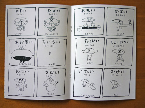
photo taken from Takahashi's zine, Chotto Omoshiroi

Mogu Takahashi is my number one favourite artist and her carefree style is a huge inspiration to me. She paints and draws and makes with such a joyous spirit of freedom and spontaneity, with childish humour and aloofness running gleefully through her work. She is also an artist who expresses herself in book form. This is something I can relate to, and my reason for talking about her, because I have made art books previously and loved the form.

With a book, as Paul and I discussed in a recent tutorial, you are able to create, and invite viewers into, your own intense and tiny little world. I think returning to the book as a method of presenting my work may be a good idea at this time, as a book can tie many paintings together with a sort of visual narrative, and it automatically turns paintings into a single more tactile object which viewers are forced to interact with. This seems a good way of involving people in my work and encouraging people to become invested in my work and responsive to it as they turn pages and inspect the book themselves. Even the noise the pages make, or how they bend as a person turns them - these things can become part of the artwork itself, contributing to a deeper visceral experience.

action plan & what I have learnt recently

I realise that I've been sorely lacking in thinking about what my work is and I'm so glad I had the opportunity to do the library exhibition because it's shown me just how rewarding experimentation and contextualising my work is. I've been doing flat, small paintings lately (see images below) and nothing new has been happening. I haven't been progressing and considering exciting new modes and plans and it's really disappointing to face that considering how much the DAS essay and the exhibition have offered in terms of understanding and elaborating on my own work.


I recognise this, however, and am going to make a big effort in setting up a routine for myself to actively experiment, reflect, and contextualise my work and it's formal elements.

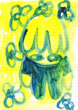
The flat paintings I've been making on a5 lined paper (such as those above) have allowed me to test colours, and have been an important part of my pre-library work as colour was an important component of the pieces exhibited.


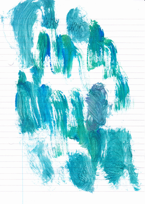
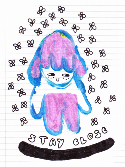
I have tested and found beautiful colour and texture combinations (above) and have made many paintings and drawings of my typical character (below), slowly perfecting and adapting my ideal cartoon form.


I must concentrate now on drawing from artists, shows, documentaries, and endless things around me to refine my message and form, as well as further exploring the possibilities for exhibiting my physical work and which form it should assume for the right impact and audience involvement.

My favourite art pieces are often posted here, so you can look back through a time frame on those pages and get a good idea of the forms I am using and playing with across weeks and months.

Maximum Irony, Maximum Sincerity

I looked at Andy Holden's installation "Maximum Irony, Maximum Sincerity 1999-2003: Towards a Unified Theory of MI!MS" after Paul suggested it might have some relevance for me, and after reading (on this page), "MI!MS is about the willingness to be lied to and the will to believe! It’s about the intense sadness of our unrealistic dreams, and the intense joy of our desire for them." From the MI!MS manifesto, I was struck by the poetry and familiarity of that attitude, and I recognised inside myself the idealistic joy of which it speaks.

Holden's installation is a vast testament to the collective named MI!MS (which he founded with friends), a loving representation of the history of the collective, both a museum and an artefact itself. It does remind me of ideas I had about creating an installation in the form of a sort of child's wonderland - a vision which is still present in my smaller and less ambitious work.

Like them, I've created a world, but mine is nestled inside my head and only occupies small spaces. The MI!MS world is lavish and bombastic, whereas mine is miniature, contained, and perhaps even guarded, only allowed out in small and specific forms.